Why Color Is the Secret Ingredient in Restaurant Branding
Before a customer reads your menu, smells your food, or takes a single bite, they have already made a judgment about your restaurant. That judgment is largely driven by color.
Color psychology in restaurant branding is not a trend or a design luxury. It is a strategic tool that shapes how people feel, how hungry they get, how long they stay, and how much they spend. Research shows that color can boost brand awareness by up to 80 percent and influence initial purchasing decisions within the first 90 seconds of interaction. In an industry where first impressions happen in a glance, choosing the right palette can be the difference between a packed dining room and an empty one.
In this guide, we break down the science behind color and appetite, examine real-world examples from the world’s most successful restaurant brands, and give you a practical framework for choosing colors that align with your restaurant concept.
The Science: How Colors Affect Appetite and Behavior
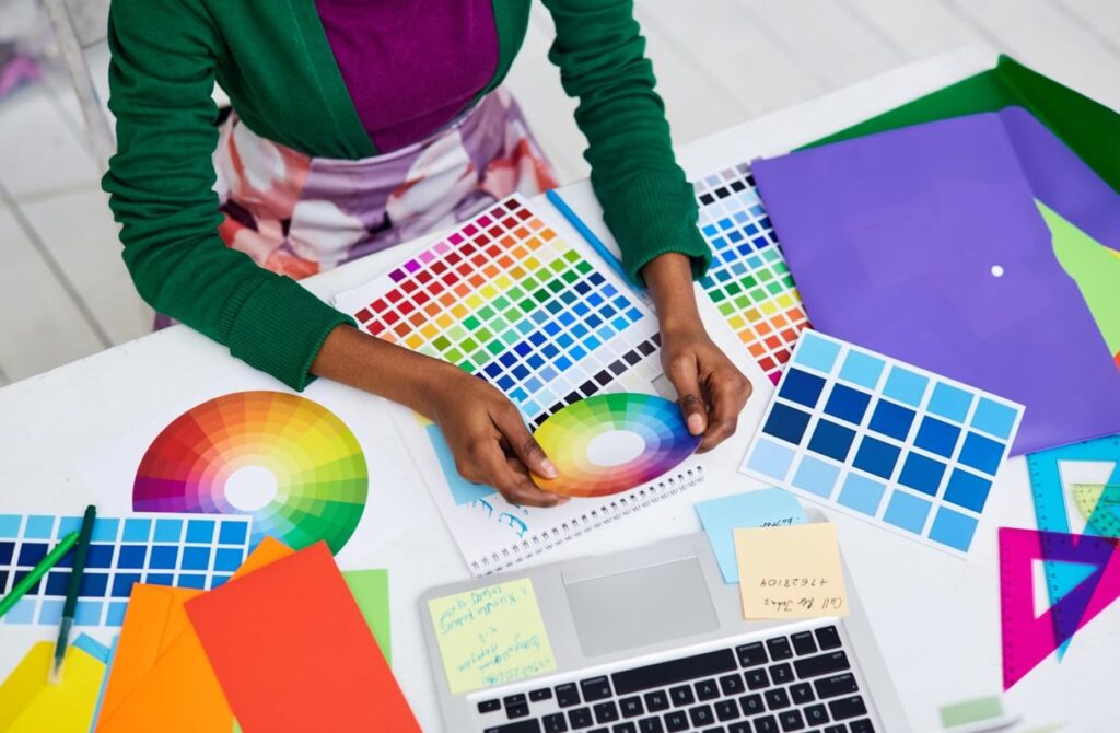
Colors influence us on both conscious and subconscious levels. They trigger emotional and even physiological responses. In the context of food and dining, colors can be grouped into three categories based on their effect on appetite:
| Category | Colors | Effect on Diners |
|---|---|---|
| Strong Appetite Stimulants | Red, Orange, Yellow | Increase heart rate, stimulate hunger, encourage impulsive ordering, create a sense of urgency |
| Mild Stimulants | Green, Turquoise, Earth tones | Evoke freshness, health, and natural quality; encourage trust and relaxation |
| Appetite Suppressants | Blue, Purple, Gray | Reduce hunger signals, slow down eating pace, create calm or sophisticated atmospheres |
Understanding these categories is the first step toward making intentional color decisions for your restaurant brand.
Color-by-Color Breakdown: What Each Color Communicates
Red: Urgency, Appetite, and Energy
Red is the most powerful appetite stimulant in color psychology. It raises heart rate, creates a sense of excitement, and triggers impulsive behavior. That is why red dominates fast food branding. It makes people eat faster, order more, and leave sooner, which is exactly the high-turnover model fast food chains depend on.
Real-world examples: McDonald’s, KFC, Wendy’s, Chick-fil-A, Five Guys
Red also increases the perception that food is flavorful. Studies have shown that people rate food served on red plates or in red-branded environments as tasting more intense.
Yellow: Happiness, Attention, and Comfort
Yellow grabs attention faster than any other color. It reflects energy, optimism, and warmth. Psychologically, it stimulates mental activity and creates feelings of happiness and comfort. When paired with red, it creates an almost irresistible call to action.
Real-world examples: McDonald’s (the Golden Arches), Subway, Denny’s, Sonic
Yellow is especially effective in signage and exterior branding because of its high visibility, even from a distance or at highway speed.
Orange: Enthusiasm and Friendly Energy
Orange combines the appetite-stimulating power of red with the cheerfulness of yellow. It feels approachable, casual, and fun. It works especially well for family-oriented restaurants, casual dining, and food brands that want to feel energetic without being aggressive.
Real-world examples: Dunkin’, Hooters, Fanta (beverage crossover), Popeyes (accent)
Green: Freshness, Health, and Sustainability
Green immediately signals natural, organic, and healthy. For restaurants focused on salads, plant-based menus, farm-to-table concepts, or sustainability, green is the obvious choice. It builds trust and positions your brand as a conscious, health-forward option.
Real-world examples: Sweetgreen, Whole Foods Market, Subway (updated branding), Panera Bread (accent)
Black and Dark Tones: Luxury, Exclusivity, and Sophistication
Fine dining restaurants gravitate toward black, charcoal, deep navy, and dark burgundy because these colors communicate exclusivity, elegance, and premium quality. Dark tones slow diners down, encouraging them to linger, order another course, and enjoy the experience rather than rush through it.
Real-world examples: Nobu, STK, Joel Robuchon, most Michelin-starred restaurant identities
Dark palettes also provide a neutral backdrop that makes food photography pop, which is critical in the age of social media and delivery app listings.
Blue: Calm, Trust, and… Appetite Suppression
Blue is widely used in corporate branding for trust and reliability, but it is the least appetizing color in food contexts. Very few natural foods are blue, so our brains do not associate the color with eating. However, blue can work as an accent in seafood restaurants or brands that want to emphasize calm, trustworthiness, or coastal themes.
Real-world examples (limited): Long John Silver’s (accent), some seafood and coastal brands
Interestingly, research suggests blue makes people more deliberate with spending. If your goal is to signal premium value without urgency, a touch of blue can be strategic.
Brown and Earth Tones: Warmth, Comfort, and Artisan Quality
Brown evokes coffee, chocolate, baked goods, and rustic charm. It works beautifully for bakeries, coffee shops, BBQ joints, and any concept built around comfort food or artisan craft.
Real-world examples: Cracker Barrel, Nespresso, many artisan bakery brands
White: Cleanliness, Minimalism, and Modern Simplicity
White communicates purity and cleanliness. It is commonly used in modern, minimalist restaurant concepts, especially those that want the food to be the visual centerpiece. White-dominant branding signals a refined, uncluttered experience.
Real-world examples: Chipotle (clean interiors), many contemporary sushi and poke concepts
Why Fast Food Chains Almost Always Use Red and Yellow
This is one of the most frequently asked questions in restaurant branding, and the answer is rooted directly in psychology and business strategy:
- Red stimulates appetite and urgency. Customers feel hungrier and are more likely to make impulsive food decisions.
- Yellow attracts attention and creates comfort. It draws eyes to signage and makes the brand feel welcoming.
- Together, they speed up the dining cycle. The combination encourages people to eat quickly and leave, which maximizes table turnover and revenue per hour.
- High visibility from a distance. Red and yellow are the two most visible colors to the human eye, making them ideal for roadside signage and drive-through branding.
This is not a coincidence. Brands like McDonald’s, Burger King, Wendy’s, and In-N-Out have invested millions in research that validates this color strategy.
Why Fine Dining Chooses Dark, Muted Palettes
At the opposite end of the spectrum, fine dining establishments deliberately avoid bright, stimulating colors. Here is why:
- Dark tones slow the pace. They encourage guests to savor each course and spend more time (and money) at the table.
- They signal exclusivity. Black and deep jewel tones are associated with luxury across all industries, from fashion to automobiles.
- They minimize distraction. The food, the plating, and the service become the focal point when the environment is understated.
- They justify premium pricing. Customers subconsciously expect to pay more in environments that look and feel upscale.
The 70-20-10 Rule for Restaurant Color Schemes
One of the most effective frameworks for applying color in restaurant branding and interior design is the 70-20-10 rule:
- 70% dominant color: This is your base. It covers walls, major surfaces, and the overall brand backdrop. It sets the mood.
- 20% secondary color: This adds depth and supports the primary color. Think furniture, accent walls, or secondary brand elements.
- 10% accent color: This is where you create visual interest and draw the eye. Menu highlights, call-to-action buttons on your website, napkins, or signage details.
For example, a farm-to-table restaurant might use 70% warm white (clean, open feel), 20% sage green (freshness and nature), and 10% terracotta (warmth and earthiness).
How to Choose Brand Colors for Your Restaurant: A Step-by-Step Framework
Choosing colors should not be based on personal preference alone. Here is a practical process:
Step 1: Define Your Brand Personality
Ask yourself: Is your restaurant fast and fun? Warm and family-oriented? Sleek and upscale? Healthy and conscious? Your brand personality should drive every color decision.
Step 2: Identify Your Target Customer
Different demographics respond to colors differently. A Gen-Z-focused poke bowl concept will use a different palette than a steakhouse targeting business professionals. Research your audience’s preferences and expectations.
Step 3: Study Your Competitors
Look at what other restaurants in your market and category are doing. You want to align with industry expectations enough to be recognizable, but differentiate enough to stand out. If every competitor uses red and black, consider how a different approach might capture attention.
Step 4: Apply the 70-20-10 Rule
Select your dominant, secondary, and accent colors. Test them across all brand touchpoints: logo, menu, interior, website, social media, packaging, and delivery app listings.
Step 5: Test and Iterate
Colors look different on screens, on paper, and on walls under different lighting. Test your palette in real-world conditions. Get feedback from people who match your target customer profile before committing.
Color Psychology Across Restaurant Touchpoints
Your brand colors should be consistent everywhere your customer interacts with you. Here is how color psychology applies across key touchpoints:
| Touchpoint | Color Strategy |
|---|---|
| Logo | Use your strongest brand color here. It must be recognizable at any size and on any background. |
| Menu Design | Use accent colors to highlight high-margin items. Red or orange boxes around featured dishes increase order rates. |
| Interior Design | Follow the 70-20-10 rule. Consider how lighting changes color perception throughout the day. |
| Website & Online Ordering | Use accent colors for CTA buttons (“Order Now,” “Reserve a Table”). Keep backgrounds neutral so food photos stand out. |
| Packaging & Takeout | Consistent color reinforces brand recall. Branded packaging in your core colors turns every delivery into marketing. |
| Social Media | Maintain a cohesive color palette across posts. This builds visual brand identity and increases follower recognition. |
Common Color Mistakes in Restaurant Branding
Avoid these pitfalls when selecting your restaurant’s color palette:
- Using too many colors. More than three or four main colors creates visual noise and weakens brand recognition.
- Ignoring cultural context. Colors carry different meanings in different cultures. White symbolizes purity in Western contexts but mourning in some Asian cultures. If your restaurant serves a diverse community, research how your colors will be perceived.
- Choosing colors based on personal taste alone. Your favorite color might not serve your brand or your customer. Let strategy lead the decision.
- Inconsistency across touchpoints. If your logo is green but your interior is all red and your website is blue, your brand feels disjointed and forgettable.
- Underestimating lighting. A wall color that looks perfect in natural daylight may look completely different under warm interior lighting at dinner service.
Real-World Brand Breakdowns
Let’s look at how some of the most recognizable restaurant brands apply color psychology:
McDonald’s
Colors: Red and yellow (with a shift toward green in European markets)
Strategy: Red drives appetite and urgency. Yellow signals happiness and grabs attention from the road. The shift to green in some locations signals a move toward health-consciousness and sustainability.
Starbucks
Colors: Green and white
Strategy: Green represents relaxation, community, and a connection to nature. The brand positions itself as a “third place” between home and work. The calming green encourages people to stay, work, and buy another drink.
In-N-Out Burger
Colors: Red, yellow, and white
Strategy: Classic fast food stimulants paired with clean white to signal freshness and simplicity. The retro palette reinforces nostalgia and the brand’s commitment to a simple, quality menu.
Nobu
Colors: Black, white, and natural wood tones
Strategy: A minimal, dark palette reflects Japanese aesthetic principles and high-end exclusivity. The restraint in color lets the food and experience take center stage.
Sweetgreen
Colors: Green, white, and warm neutral tones
Strategy: Green dominates to reinforce the brand’s core identity around fresh, healthy, locally sourced ingredients. The palette feels clean, modern, and trustworthy.
Trends in Restaurant Color Branding for 2026 and Beyond
As consumer preferences evolve, so do color trends in restaurant branding. Here are the directions we are seeing:
- Earth tones and natural palettes continue to grow as sustainability becomes a core expectation, not just a differentiator.
- Muted, desaturated tones are replacing bold primary colors in fast-casual and health-forward concepts.
- Dark, moody interiors are expanding beyond fine dining into elevated casual concepts that want to offer an “experience.”
- Warm minimalism (cream, beige, terracotta, soft olive) is becoming a dominant aesthetic in new restaurant openings, especially in urban markets.
- Color personalization in digital ordering. Some brands are beginning to use dynamic color schemes in their apps that shift based on time of day, menu category, or user preferences.
Frequently Asked Questions
What is the psychology of color in restaurants?
Color psychology in restaurants is the study of how different colors influence customer behavior, mood, appetite, and spending in a dining environment. Certain colors like red and yellow stimulate hunger and urgency, while cooler tones like blue and gray tend to suppress appetite. Restaurant owners use this knowledge to design branding and interiors that encourage specific behaviors, from faster table turnover to higher average check sizes.
What is the best color for a restaurant logo?
There is no single best color. The right color depends on your restaurant type and target audience. Red and orange work well for fast food and casual dining because they stimulate appetite. Green is ideal for health-focused and farm-to-table concepts. Black and dark tones suit fine dining and luxury brands. The best approach is to choose colors that align with your brand personality and the emotions you want to trigger in your customers.
What is the 70-20-10 rule for colors?
The 70-20-10 rule is a design guideline for creating balanced color schemes. It recommends using your dominant color for 70% of your visual space, a secondary color for 20%, and an accent color for 10%. In restaurant branding, this applies to both interior design and visual brand identity, ensuring your palette feels cohesive without being monotonous.
What is the 80/20 rule for colors?
The 80/20 rule is a simplified version of the 70-20-10 framework. It suggests using a neutral or dominant color for 80% of your visual space and a bolder accent color for the remaining 20%. This approach is common in minimalist restaurant designs where the focus is on clean spaces with strategic pops of color to guide the customer’s eye.
Why do most fast food restaurants use red in their branding?
Red increases heart rate, stimulates appetite, and encourages impulsive decision-making. For fast food brands that rely on high traffic, quick ordering, and fast table turnover, red is the most effective color to drive the behaviors that support their business model. When paired with yellow, which attracts attention and creates a sense of warmth, the combination is especially powerful for roadside visibility and instant brand recognition.
Does restaurant color really affect how much customers spend?
Yes. Research consistently shows that color influences spending behavior. Red environments encourage impulsive decisions, making customers more likely to add extra items. Dark, sophisticated palettes make customers feel they are in a premium environment, which increases their willingness to pay higher prices. Blue, on the other hand, tends to make people more cautious and deliberate with their spending.