
This colorful, kidney-shaped graphic represents the limits of human color vision — the smaller triangle inside marks the colors that can be displayed on a standard sRGB monitor, and the larger triangle represents P3 displays.

Each corner of the triangle is one of the three “primaries” of light: red, green, and blue. The area inside the triangle represents how those three colors appear when added together in various combinations, hence the term “additive color model.”
The use of the term “primary” is a bit of a misnomer, though, as there is no set of three real colors in the real world that can be mixed to create all the other colors. Only a subset of colors, as defined by these triangles.
In The Eye Of The Beholder Or The Mind?
A SIMPLE OVERVIEW OF HUMAN VISION
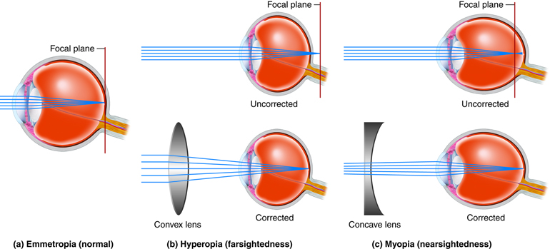
Light is focused by the eye’s lens onto the light-sensitive cells in the back of the eye, known as the retina. The cells we are most interested in are called cones, which are responsible for our daylight and color vision. A different kind of cells, called rods, gives us night vision, but rods are not particularly helpful for tasks like reading, and rods essentially shut down in daylight conditions.
Standard or “normal” vision uses three cone types. They are sometimes but inaccurately called “red,” “green,” and “blue” cones, but there is much more to this story.
COLOR IS NOT REAL
Is color not real? That’s a provocative statement for an article on color and contrast. But the reality is that “color” and “contrast” are not strictly real in an absolute sense. “Colored” light is simply light of different wavelengths or frequencies, like different notes on a piano. In fact, the scientific names for the cone cells in our eye are L, M, and S cones which stand for the long, medium, and short wavelengths of light they are most sensitive to.

The L cone actually has a peak sensitivity near yellow/green. But the fact its response curve extends into deep reds gives a differential from the M cone that allows humans to perceive “red” as a unique hue. As you can see from the graphic, the responses of the cones all overlap very substantially.
One reason the L cone is thought of as “the red cone” is that the primary red light from a display or television is intended to stimulate the L cone as much as practical while not stimulating the M cone. So the color used in a display is not at the peak response of the L cone but at a much longer wavelength to reduce “crosstalk” to the M cone.
Nevertheless, this is not where the sensation of color really takes place — that rabbit hole is just a bit deeper.
The first stage of the visual cortex, located at the back of the brain, looks at the lightness/darkness contrasts first, finding edges and fine details. Later stages separately process the color information, meaning hue and chroma (chroma is the “colorfulness” and related to “saturation”). Over 20% of our brain is dedicated to visual processing, and in total, 62% of our brain involves vision, often shared with other senses such as touch or hearing.
Some of the visual information may be “steered” to the Visual Word Form Area (VWFA), where letter pairs and whole words are recognized and sent to the language center. Other information may be sent to areas of the brain specializing in motion detection or object recognition. The information “steered” to the VWFA is essentially luminance only, that is, devoid of color, while the object recognition area relies more on color for discrimination.
THE IMAGINARY REALITY OF PERCEPTION #
What might not be apparent from the above discussion of the mechanics of our vision is that colors are just perceptions, and as perceptions, they are affected very much by context. In other words, the nature of the surrounding visual material has a substantial effect on the colors and contrasts that we perceive and how we perceive them.
 In this graphic, both yellow dots emit the same exact “colors” from your monitor, yet they look decidedly different. And while such images are often referred to as *optical illusions*, ones such as this are really *neurological* illusions — they are literally a figment of your brain, no matter how much we want to believe it as reality.
Monitors present us with nothing but illusions. On your computer’s display, the “yellow” you perceive is only separate red and green, with the red and green in amounts that create the perception of yellow. The red and green do not mix in the air like paint — the red and green “mixes” in the neurology of the vision system.
THROWING YOU A CURVE (EYE) BALL #
And to add to this, our perception is what you’d call non-linear, while light in the real world is “linear,” by which I mean if you have 100 photons of light and triple that, you then have 300 photons of light. But our vision does not see that change as a “tripling” — we see it as only a modest increase. This is particularly important for understanding the perception of contrast.
To help, when we talk about light or luminance, we are talking about linear, additive quantities. But when we talk about lightness/darkness/brightness, we talk about a qualitative and context-dependent perception. Stevens et alia found that we can use power-curves to model our perception in a useful way.