

Every brand eventually hits the same wall. A sales deck shows a stretched logo. A social post uses a slightly-off blue. A freelance copywriter writes in a voice nobody recognises. None of it is anyone’s fault. It happens because no one wrote the rules down properly.
That document is your brand guidelines, and the question we get asked most often at Banana Produced is deceptively simple: what to include in brand guidelines so they actually get used instead of gathering dust in a shared drive?
Below is the section-by-section structure we deliver to clients. It covers the strategy layer, the visual system, the verbal system and the governance rules that keep everything from drifting. Use it as a checklist, whether you are briefing an agency or building the document yourself. See brandkit.com for their take.
The short answer: the 14 sections a complete brand guidelines document needs
If you only read one part of this article, read this table. It maps every section, what it prevents, and whether it is essential or situational.
| # | Section | What it prevents | Priority |
|---|---|---|---|
| 1 | Brand story, mission and values | Teams making decisions with no shared context | Essential |
| 2 | Positioning, audience and personality | Generic, interchangeable messaging | Essential |
| 3 | Logo suite and lockups | People inventing their own logo versions | Essential |
| 4 | Clear space, minimum size and placement | Cramped, illegible logo application | Essential |
| 5 | Logo misuse examples | Stretching, recolouring, drop shadows | Essential |
| 6 | Colour palette and codes | Screen and print colour mismatches | Essential |
| 7 | Typography system and type scale | Random font sizes and substitutions | Essential |
| 8 | Iconography and graphic devices | Mixed icon sets from stock libraries | Recommended |
| 9 | Photography and art direction | Cliché stock imagery that dilutes the brand | Essential |
| 10 | Motion, video and sound | Inconsistent intros, subtitles and transitions | Recommended |
| 11 | Tone of voice and messaging | Every writer sounding like a different company | Essential |
| 12 | Layout, grid and spacing | Unbalanced decks, ads and pages | Recommended |
| 13 | The brand in application | Rules that nobody knows how to apply | Essential |
| 14 | Governance, assets, AI use and contacts | Outdated files circulating for years | Essential |
Now the detail. Each section below explains what goes in it, and the specific failure it exists to prevent.
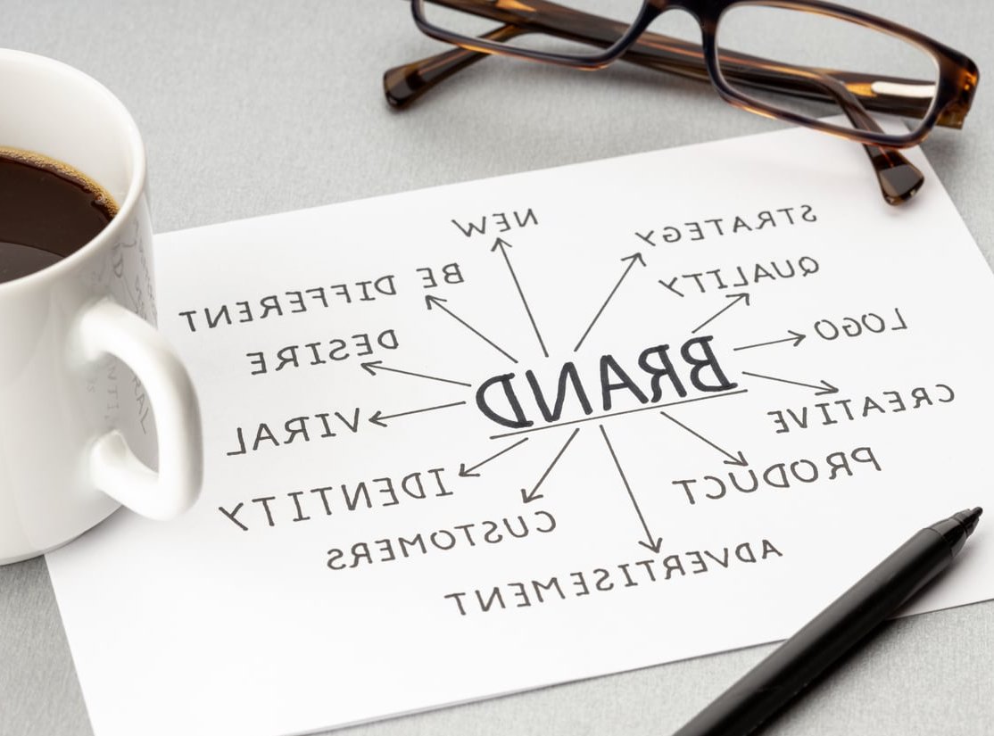
1. Brand story, mission, vision and values
Guidelines that open with a logo grid tell people what to do. Guidelines that open with the story tell them why, which is what they need when they face a situation your document never anticipated.
Include:
- A short origin story, two or three paragraphs maximum
- The mission (what you do today) and the vision (where you are heading)
- Three to five values, each with a one-line behavioural explanation
- The meaning behind the name and tagline if there is one
Keep it tight. If this section runs past four pages, nobody reads the rest of the document.
2. Positioning, target audience and brand personality
This is the bridge between strategy and execution, and it is the section most DIY guidelines skip entirely.
- Positioning statement: for [audience], [brand] is the [category] that [differentiator], because [proof point]
- Audience snapshots: two or three primary segments with their goals and objections, not full 10-page personas
- Competitive context: who you are measured against and what you refuse to sound like
- Personality traits: expressed as sliders or pairs, for example “confident but never arrogant”, “playful but never unserious”
Those personality traits do real work later. They are the reference point when someone argues about whether a headline is too casual. There’s a good explainer over at adobe.com.
3. Logo suite and lockups
Show every approved version and label each one with its intended use case. A typical suite includes:
- Primary logo (horizontal lockup)
- Secondary or stacked version for square and vertical spaces
- Symbol, monogram or icon-only mark for avatars and favicons
- Wordmark on its own
- Monochrome, all-white (knockout) and single-colour variants
- Co-branding and endorsement lockups if you operate a brand family
For each variant, state exactly when to use it. “Use the stacked version when the available width is under 200px” is a rule. “Use whichever works best” is not.

4. Clear space, minimum size and placement rules
This is the section that separates amateur guidelines from professional ones, and it takes ten minutes to write.
Clear space
Define exclusion zones relative to an element of the logo itself, never in fixed millimetres. The common convention is to use the height of the capital letter, the width of the symbol, or half the symbol height as your measuring unit. That way the rule scales from a business card to a building.
Minimum sizes
Give separate figures for print and screen. Example format:
| Logo version | Minimum width (print) | Minimum width (screen) | Clear space |
|---|---|---|---|
| Primary horizontal | 30 mm | 120 px | 1x symbol height |
| Stacked | 20 mm | 80 px | 1x symbol height |
| Symbol only | 8 mm | 32 px | 0.5x symbol height |
Placement and backgrounds
Show the logo on light, dark, brand-colour, photographic and busy backgrounds. Specify the maximum acceptable image busyness, or require a scrim or overlay above a certain contrast threshold.
5. Logo misuse: the do-not page
Visual examples with red crosses are the single most-referenced page in most brand books. List at minimum:
- Do not stretch, squash or rotate
- Do not recolour outside the approved palette
- Do not add effects: shadows, gradients, outlines, bevels
- Do not rebuild the lockup or change spacing between elements
- Do not place on low-contrast or cluttered backgrounds
- Do not enclose in a shape that is not part of the approved suite
- Do not swap the typeface in the wordmark
- Do not use the logo inside a sentence as a word
6. Colour palette with complete codes
A hex code alone is not enough. Anyone producing print, signage, packaging or apparel needs the rest.
For every colour, include:
- HEX for web
- RGB for digital design files
- CMYK for four-colour print
- Pantone (spot) for brand-critical print and merchandise
- RAL or vinyl reference if you produce signage, vehicles or interiors
Then add the parts most guidelines forget:
- Hierarchy: primary, secondary and accent, with rough usage ratios such as 60 / 30 / 10
- Approved pairings: which colours may sit on which, and which combinations are banned
- Accessibility: contrast ratios for text on each background, with a stated target of WCAG AA at minimum. This is no longer optional for anyone selling into the EU public or consumer market
- Tints and shades: approved percentages rather than “lighten as needed”
- Semantic colours: success, warning and error states for product and UI teams
7. Typography system and type scale
Name the typefaces, then explain the system.
- Primary and secondary typefaces, with the specific weights that are licensed and approved
- Fallback fonts for email, Office documents and any environment where the brand font cannot be embedded. Without this, someone will pick Comic Sans. It happens.
- Licensing details: how many seats, where the licence sits, who to ask for access
- A type scale with sizes, line heights and letter spacing for H1 through to captions, given for both print and screen
- Rules on alignment, hyphenation, widows, orphans and maximum line length
- Approved use of uppercase, italics and underlining

8. Iconography, graphic devices and patterns
If your brand has a supporting visual language, document it or watch it disappear. How to create a consistent brand style guide covers this in more depth.
- Icon style: stroke weight, corner radius, grid size, filled versus outlined
- Where to source new icons and who approves them
- Brand devices: shapes derived from the logo, dividers, frames, crops
- Patterns and textures with scale and density rules
- Data visualisation: chart colours in a fixed order, axis styling, label typography
9. Photography and art direction
This is where brands slip fastest, because photography is bought and commissioned by people who never open the brand book. Make this section as visual as possible.
What to specify
- Subject matter: real people versus product, candid versus posed, environments and contexts
- Composition: framing, negative space for text overlay, preferred crops and aspect ratios
- Lighting: natural or studio, hard or soft, warm or neutral
- Colour treatment: whether a grade or LUT is applied, saturation levels, black point
- Casting and diversity guidance: who appears in your imagery and how they are represented
- Post-production: acceptable retouching, banned filters
The do and do-not grid
Nothing beats two side-by-side galleries: eight images that are on-brand, eight that are close but wrong, each with a one-line reason. This is the fastest way to align a stock-image buyer or an external photographer.
Also include practical notes: image resolution minimums, file naming conventions, alt-text expectations, and where the approved image library lives.
10. Motion, video and sound
Most brand output is now moving, and yet motion is the most commonly missing section. If your brand appears on social video, product demos, events or ads, document:
- Logo animation: approved intro and outro, duration, easing
- Transitions, wipes and reveals that belong to the brand
- Subtitle and caption styling: font, size, position, safe areas, background plate
- Lower thirds and title card templates
- Aspect ratio deliverables: 16:9, 9:16, 1:1, 4:5
- Audio identity: sonic logo, approved music library or mood, voiceover tone and accent
- Pacing and cut rhythm, which sounds abstract until you compare two edits side by side
At Banana Produced this section is often the one clients did not know they needed until their third video looked nothing like the first two.

11. Tone of voice and messaging framework
Verbal identity deserves as much space as the visual system. Abstract adjectives are not enough, so build this section around examples.
Include
- Three to four voice principles, each with a “we do this / we don’t do this” pair
- Before and after rewrites of real sentences from your own website
- Vocabulary list: words to use, words to avoid, and the correct spelling and capitalisation of your product names
- Grammar and mechanics: Oxford comma or not, sentence case or title case in headings, date and number formats, contractions allowed or not
- Tone shifts by context: the voice stays constant, the tone changes
A simple context table works well:
| Context | Tone | Example opener |
|---|---|---|
| Homepage headline | Bold, direct | “Ship your brand, not your best guess.” |
| Support reply | Warm, plain | “Thanks for flagging this. Here is what happened.” |
| Error message | Calm, useful | “That file is too large. Try under 25 MB.” |
| Legal or compliance | Precise, neutral | “This agreement applies from the date of signature.” |
Round the section off with your messaging hierarchy: the one-line pitch, the 25-word version, the 100-word boilerplate, and three proof points. Copywriters will use these constantly.
12. Layout, grid and spacing
Consistency in layout is what makes two pieces produced by different people feel related.
- Column grids for print and for web breakpoints
- Margin and gutter rules
- A spacing scale, typically a 4px or 8px base unit for digital
- Standard document sizes you actually produce, from A4 to social formats
- Composition principles: where the logo sits, how much white space to protect, how text and image blocks relate
13. The brand in application
Rules become real when people see them applied. This section is essentially a gallery of correct examples, and it is what stops the guidelines being treated as theory.
Cover the touchpoints you genuinely use:
- Business cards, letterhead, email signature
- Slide deck templates, including a title, section, content and data slide
- Website components: buttons, forms, cards, navigation
- Social profile assets and post templates per platform
- Advertising formats, both static and video
- Packaging, labels and print collateral
- Signage, uniforms, vehicles, event stands and merchandise
Each example should be captioned with the reason it works, not just presented as decoration.
14. Governance: assets, AI usage, approvals and contacts
The final section is the one that determines whether the other thirteen survive contact with reality.
Asset library and file formats
| Use case | Format |
|---|---|
| Web and app | SVG, PNG with transparency, WebP |
| Print and large format | EPS, AI, vector PDF |
| Office documents | PNG, EMF |
| Motion and video | MOV with alpha, Lottie, After Effects project |
AI usage rules
This section is now standard in the guidelines we deliver. Set out clearly:
- Whether generative AI imagery is permitted, and in which contexts
- Whether AI-generated visuals must be labelled
- Approved prompts or style references that produce on-brand output
- Rules for AI-assisted copy: always human-edited, never published unreviewed
- What must never be fed into third-party tools, such as unreleased assets or customer data
- How your brand should be described to AI systems, which increasingly shapes how you are summarised in search results and assistants
Approvals and version control
- Who owns the brand internally and who signs off exceptions
- The review process for new assets and external partners
- Version number, publication date and review cycle printed on the document
- A single canonical link where the current version lives
- A named contact with an email address for questions
Include a changelog. One page listing what changed and when saves an enormous amount of confusion in year two.

What to leave out of brand guidelines
Bloat is the main reason guidelines go unread. Keep these out of the main document:
- Full market research decks and survey data
- Complete persona documents with fictional biographies
- The internal rationale for every design decision
- Detailed campaign plans, which date within months
- HR policy, legal terms and anything unrelated to expressing the brand
Link to them from an appendix instead.
How long should brand guidelines be?
| Organisation type | Typical length | Focus |
|---|---|---|
| Startup or solo founder | 10 to 20 pages | Logo, colour, type, voice, social |
| Growing SME | 25 to 50 pages | Full visual and verbal system plus applications |
| Multi-market or multi-brand | 60 pages or a hosted brand hub | Architecture, localisation, governance, motion, product UI |
PDF or a live brand hub?
A PDF is fine for small teams and easy to email. The moment more than a handful of people or any external partners touch the brand, a hosted brand hub wins. It gives you one live URL, downloadable assets sitting next to the rules that govern them, and no risk of a two-year-old file circulating as gospel.
Our recommendation: publish a live hub as the source of truth, and export a lightweight PDF summary for offline use, clearly stamped with a version number and a link back to the hub.
A quick self-audit
Run your current document against these questions. Every “no” is a gap that will cost you consistency later.
- Can a new freelancer produce an on-brand social post using only this document?
- Are all four colour code systems present for every brand colour?
- Is clear space defined proportionally rather than in fixed units?
- Is there a fallback font specified for email and Office?
- Are there before-and-after copy examples, not just voice adjectives?
- Does the photography section show wrong examples as well as right ones?
- Is there a rule for AI-generated content?
- Is there a named person to contact and a version date on the cover?
FAQ
What are the 5 essential elements of brand guidelines?
If you strip everything back, the five non-negotiables are: brand story, logo usage, colour palette, typography and tone of voice. Add photography direction and a contact for approvals and you have a workable minimum viable brand book.
What is the difference between brand guidelines and a style guide?
Brand guidelines cover the whole identity, including strategy, positioning, visuals, voice and governance. A style guide is usually narrower: either a visual style guide (logo, colour, type) or an editorial style guide (grammar, spelling, formatting). In practice the terms get used interchangeably, so agree on the scope before commissioning one.
What are examples of brand guidelines?
Widely referenced public examples include the guidelines published by large consumer brands, universities and public institutions, most of which are freely downloadable as PDFs. Look for ones in your own sector and at your own scale rather than copying a global brand with a 200-page book you will never need.
How often should brand guidelines be updated?
Review annually as a minimum, and update immediately after any of the following: a rebrand or refresh, a new product line, entry into a new market, a new primary channel such as short-form video, or a change in accessibility requirements.
Do small businesses really need brand guidelines?
Yes, and often more urgently than large ones, because small teams outsource more. The moment a second person creates something in your name, you need written rules. A focused 12-page document is enough to start.
Should brand guidelines include social media rules?
Include the parts that affect brand expression: profile image and cover specifications, post template layouts, caption tone, hashtag usage, emoji policy and how to respond to comments. Leave posting schedules and channel strategy in a separate marketing document.
Ready to build yours?
Knowing what to include in brand guidelines is the easy half. The hard half is making decisions that hold up across every format, channel and partner, then documenting them so clearly that nobody needs to ask.
That is what we do at Banana Produced. If you want a brand guidelines document built section by section, with the motion and photography direction most agencies leave out, get in touch and tell us where your brand is drifting.