
Why Font Pairing Matters for Luxury Brands
In luxury branding, typography is rarely just decoration. It is the silent ambassador of your brand’s positioning, heritage, and price point. A well chosen font pairing for luxury brands can suggest craftsmanship before a single product image appears, while a poorly considered combination can make a premium offer feel ordinary.
At Banana Produced, we work daily with designers and creative directors who need typography systems that whisper rather than shout. In this curated breakdown, we share 12 serif and sans serif pairings inspired by what high-end fashion, jewelry, and hospitality brands actually use, why those combinations work, and the mood each one creates.
The Rules of Luxury Typography
Before diving into the combinations, here are the principles that govern almost every luxury typographic system we have studied:
- Contrast with restraint: Pair a refined serif with a clean geometric sans serif, but keep weights and widths controlled.
- Generous spacing: Luxury brands use wider letter spacing, especially in headlines and uppercase wordmarks.
- Hierarchy through scale, not noise: Avoid more than two type families. Use size, weight, and tracking instead.
- Avoid trends that age fast: Stylized scripts and overly bold display fonts rarely survive a luxury rebrand.
- Respect white space: The space around your type signals confidence and value.
12 Font Pairings That Convey Premium Quality
1. Didot + Futura
Mood: Editorial, Parisian, fashion-forward.
Didot has been a staple of Vogue-style luxury for decades. The dramatic thick to thin contrast in its strokes feels couture, while Futura grounds it with geometric clarity. Use Didot for headlines and Futura for navigation, captions, and product names.
Best for: High fashion, beauty, magazine-style ecommerce.
2. Bodoni + Avenir
Mood: Refined, Italian, confident.
Bodoni shares Didot’s vertical contrast but feels slightly warmer. Paired with Avenir, you get a sophisticated palette favored by Italian fashion and fine jewelry houses.
Best for: Jewelry, leather goods, perfumery.
3. Playfair Display + Montserrat
Mood: Accessible luxury, modern boutique.
This Google Fonts duo has become the go-to for premium small businesses because it delivers a couture feel without licensing costs. Playfair brings drama, Montserrat keeps things crisp and contemporary.
Best for: Boutique hotels, premium DTC brands, wedding planners.
4. Cormorant Garamond + Lato
Mood: Romantic, literary, heritage-driven.
Cormorant has the elegance of an old Garamond with a slimmer, more modern figure. Combined with the humanist warmth of Lato, it suits brands that lean into storytelling and craftsmanship.
Best for: Wineries, artisan goods, spa and wellness retreats.
5. Libre Caslon Text + Source Sans Pro
Mood: Trustworthy, classic, American luxury.
Caslon is the typeface of choice for heritage Anglo-American brands. Paired with Source Sans Pro, it reads modern enough for digital while preserving an old-world authority.
Best for: Private banking, members’ clubs, real estate.
6. Trajan + Gotham
Mood: Architectural, cinematic, prestigious.
Trajan, modeled on Roman inscriptions, brings monumental gravitas. Gotham’s clean geometry keeps the pairing from feeling stuffy. This is the combination behind many luxury hospitality and cinema brands.
Best for: Five-star hotels, luxury cinema, awards and events.
7. Garamond + Helvetica Neue
Mood: Timeless, restrained, gallery-like.
A pairing favored by minimalist luxury, including fashion houses that have rebranded toward quiet sophistication. Garamond delivers heritage, Helvetica Neue offers neutral confidence.
Best for: Quiet luxury fashion, contemporary jewelry, art galleries.
8. Canela + Söhne
Mood: Editorial, contemporary, premium.
Two darlings of the modern luxury rebrand era. Canela’s tall, slightly flared serifs feel current without sacrificing elegance, while Söhne is a grotesque sans with quiet character.
Best for: Modern fashion, premium tech, design-led hospitality.
9. Optima + Proxima Nova
Mood: Warm, sculptural, approachable luxury.
Optima sits between serif and sans, with subtle stroke contrast that feels handcrafted. Paired with Proxima Nova, you get warmth without losing polish.
Best for: Skincare, wellness, premium food and beverage.
10. Sangbleu + Neue Haas Grotesk
Mood: High fashion, avant-garde, intellectual.
Sangbleu is a contemporary serif with sharp, almost calligraphic terminals that signal serious design intent. Pair it with Neue Haas Grotesk for runway-level sophistication.
Best for: Avant-garde fashion, niche perfumery, art publications.
11. Caslon Doric + GT Sectra
Mood: Modern editorial, considered, premium digital.
Reversing the usual order, here a refined sans leads and a wedge serif provides headline drama. This pairing is increasingly seen across luxury digital magazines and high-end ecommerce.
Best for: Luxury ecommerce, online magazines, premium SaaS.
12. Cardo + Inter
Mood: Scholarly, refined, accessible.
For brands that want to feel curated and intellectual without paying premium foundry fees, Cardo offers Renaissance-era elegance and Inter provides one of the most legible screen sans serifs available.
Best for: Independent publishers, premium education, curated marketplaces.

Comparison Table: Luxury Font Pairings at a Glance
| Pairing | Mood | Best Sector | Budget |
|---|---|---|---|
| Didot + Futura | Editorial fashion | Fashion, beauty | Licensed |
| Bodoni + Avenir | Italian refinement | Jewelry, leather | Licensed |
| Playfair + Montserrat | Modern boutique | Hotels, DTC | Free |
| Cormorant + Lato | Romantic heritage | Wineries, spa | Free |
| Trajan + Gotham | Cinematic prestige | Hospitality, events | Licensed |
| Garamond + Helvetica Neue | Quiet luxury | Fashion, galleries | Licensed |
| Canela + Söhne | Modern editorial | Fashion, tech | Premium |
| Optima + Proxima Nova | Warm luxury | Skincare, F&B | Licensed |
| Cardo + Inter | Scholarly refined | Publishing, education | Free |
How to Choose the Right Pairing for Your Luxury Brand
- Define your brand archetype. Are you heritage, modern, avant-garde, or quiet luxury? Each archetype favors different typographic territories.
- Audit your sector. Look at three direct competitors and three aspirational brands. Note their primary and secondary typefaces.
- Test in context. Set a real headline, a real product name, and a real paragraph. Luxury type must hold up across print, packaging, and screen.
- Check small sizes. Many elegant display serifs collapse at 12px. Always preview on mobile.
- Lock the system. Document weights, tracking, and use cases so your typography stays consistent as your team grows.
Common Mistakes to Avoid
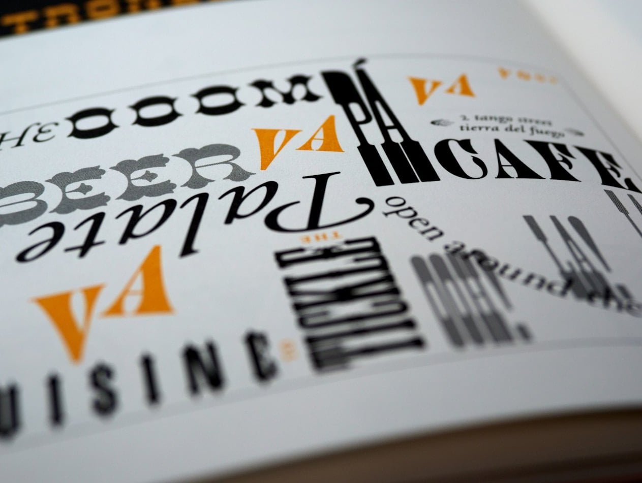
- Pairing two display fonts that compete for attention.
- Using overly decorative scripts as primary headlines.
- Tight letter spacing on uppercase wordmarks, which kills the luxury feel.
- Mixing more than two type families across a brand system.
- Choosing trendy variable fonts that will date quickly.
FAQ
What is the most common font pairing strategy for luxury brands?
The classic strategy is pairing a high-contrast serif such as Didot, Bodoni, or Garamond with a clean geometric sans serif like Futura, Avenir, or Proxima Nova. The serif handles headlines and emotional moments, while the sans serif handles navigation and body copy.
Are free Google Fonts acceptable for premium brands?
Yes, when chosen carefully. Playfair Display, Cormorant Garamond, Cardo, Libre Caslon, Montserrat, Lato, and Inter can all sit comfortably in a premium identity. Execution and spacing matter more than license fees.
Should luxury brands use serif or sans serif as their primary font?
Both work. Recent research shows that around 70 percent of major luxury fashion brands use a geometric sans serif as their primary face, often paired with a serif for editorial moments. Heritage jewelry and hospitality brands more often lead with a serif.
How many fonts should a luxury brand use?
Two is ideal. One primary face for identity and headlines, one supporting face for body and interface. A third weight or style of one of these fonts can act as an accent if needed.
What font pairing works best for a luxury hotel brand?
Trajan with Gotham, or Garamond with Helvetica Neue, both deliver the architectural authority and refined hospitality feel that premium hotels rely on.
Final Thoughts
Great font pairing for luxury brands is less about chasing trends and more about understanding contrast, spacing, and restraint. The 12 combinations above have stood the test of high-end fashion runways, jewelry vitrines, and five-star lobbies because they balance heritage with modernity. Choose the one that fits your brand archetype, document it carefully, and let the typography do the quiet work of communicating value.